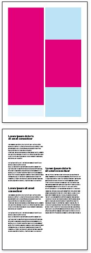
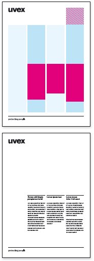
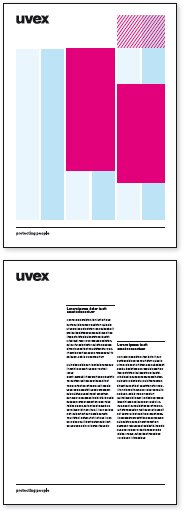
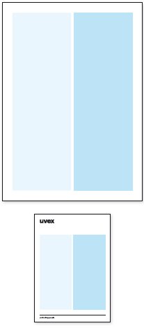
Layout
Layouts should always be split into columns (minimum: 2 columns; maximum: six columns). The columns must be within the print area. The distance from the print area to be the edge should be in multiples of the logo height Y.
The layout is adjusted to the information structure and complexity.
The distance between the columns is based on the width of the column and the overall visual should be harmonious (example for A4: 4 mm)
The rules for the spacing around the logo and the design elements are to followed when using the logo. The grid has to be cropped accordingly.
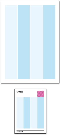
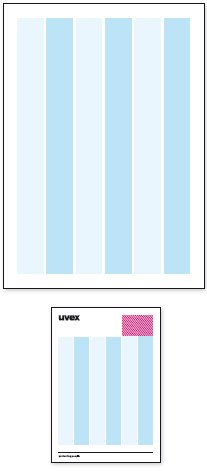
Application and examples
Within the columns lively and flexible layout is to be used.
Text blocks can be inserted in the columns, but the placement of further content such as images must be taken into account.
The goal is to get a balanced relation between free space and text blocks and other content elements.
Striking headlines can be placed separately within the columns. However, these should always be in accordance with the logo and image.