
Corporate Font
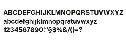
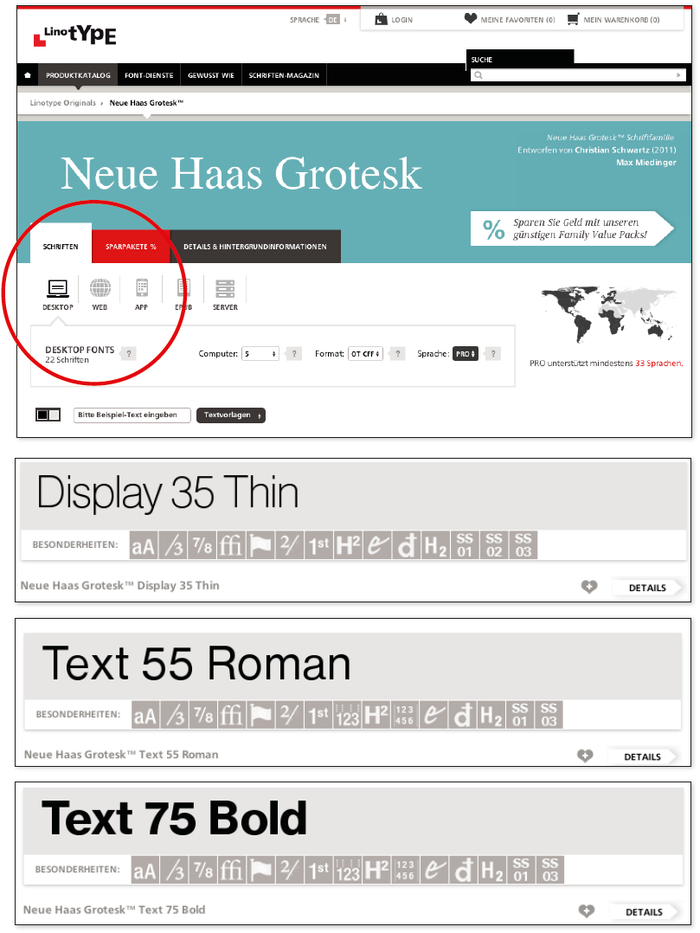
Neue Haas Grotesk is essential for the brand presence. The distinctive, clear shape of the font ensures the presence is powerful and striking. Different font options can be used in designs:
• Neue Haas Grotesk Text Pro 55 Regular (= Neue Haas Grotesk Text Pro 55 Roman)
• Neue Haas Grotesk Text Pro 75 Bold
• Neue Haas Grotesk Display Pro 35 Extra Light (= Neue Haas Grotesk Pro Display 35 Thin)
For normal office use such as letters, ppt etc the Neue Haas Grotesk Regular is used.
The Neue Haas Grotesk thin is only used for creative work.
Use of other fonts must be approved by CBM.
Text application
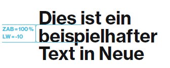
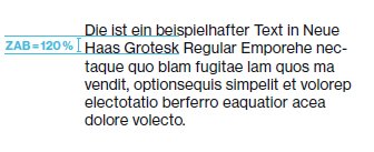
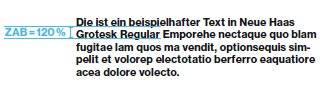
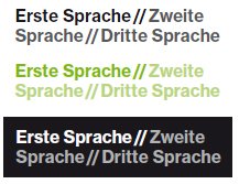
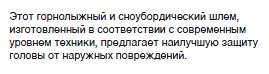
For headlines, line spacing of 100% is recommended. Depending on the size of the headline, this design can be adjusted to achieve the right visual effect, i.e. reduced. For body text, line spacing of 120% is recommended.
In addition, character spacing should be reduced for headlines. The character spacing should be adjusted to achieve the right visual effect and ensure a uniform typeface. (Character spacing should not be lower than -10 or higher than +10) The typography justification should be aligned left.
Alternative font
a. Not able to buy/use Neue Hass Grotesk
If, for any reason, it is not possible to acquire the Neue Haas Grotesk font, then Standard Helvetica should be used as an alternative.
b. Extended requirements due to new PPE regulations
The new PPE regulations require to add further languages in user manuals and other projects (e.g. declarations of confirmity, product data sheets, hangtags, etc.). To fit more characters into the same space it is necessary to use a different font. In this case Arial Unicode MS in 9pt.
Do you have any other special application scenario please contact the Corporate Branding & Marketing department via cbm@uvex.de