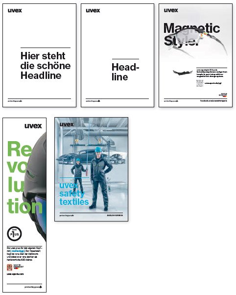
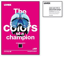
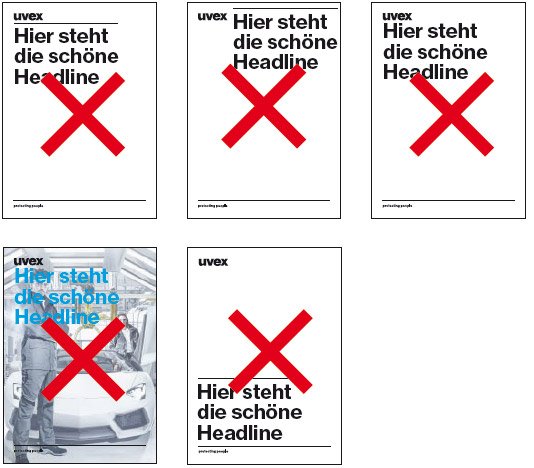
Exemplary Design
As a rule, there must be a clear hierarchy between the logo and design elements such as headlines. They must not overwhelm or neutralise, or compete with each other. The spacing between the elements must be set accordingly.
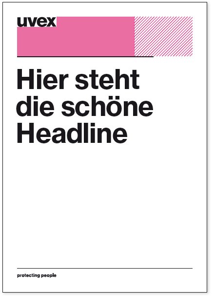
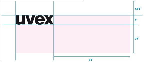
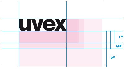
Standard distance to design elements
An exclusion space of at least 1.5 Y should be applied around the logo - this is the minimum distance. The standard spacing is 3 Y vertically and 8 Y horizontally. The aim is to use the availalbe space in the best possible way, that means as much clear space between the logo and the headline or other design elements.
The headline should be clearly discernible from the logo and the claim.