Secondary elements

Secondary elements

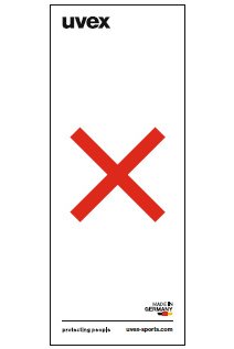
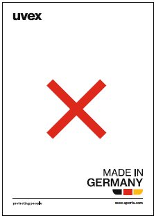
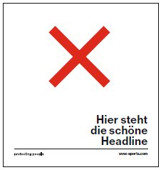
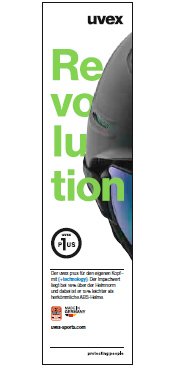
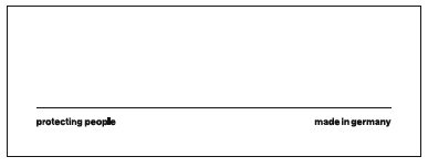
Secondary elements are additional items of information, such as a URL, the "Made in Germany" logo and any other information.

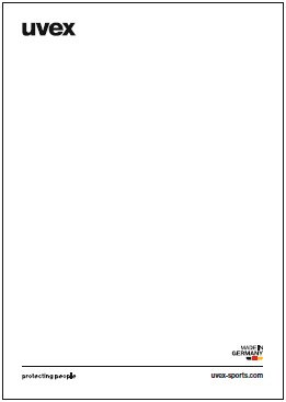
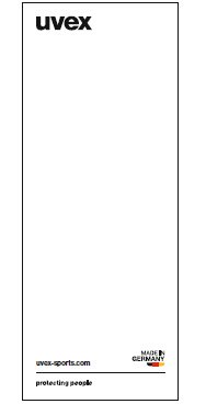
Provided there is sufficient space in the format, these should connect to the basic line. In normal cases, the positioning is specified. Only one secondary element each can be placed below or above the basic line.

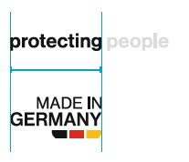
Information which is placed below the line must have a minimum distance from the claim. (it must be the width of the "protecting" of the claim, see Logo and claim: distances) If it is not possible to insert this spacing, for example due to a narrower format width, then the information must be placed elsewhere in the layout. The secondary element below the basic line is onla allowed to be single-lined.

The distance between information and the line must always be 0.5 Y  to the basic line and can never be altered.

Other layout elements such as body text must be placed at a greater distance from the basic line.
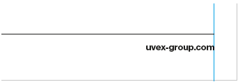
Content below the basic line should be aligned right and end at precisely the same point as the basic line.

Secondary elements

Examples

Secondary elements: URL

Using the URL

In normal cases, the URL is in a bold typeface. The size of the URL is dependent on the size of the claim. The lower case letters in the URL and claim must be exactly the same size. For standard claim sizes, the corresponding font sizes are detailed in the table below.
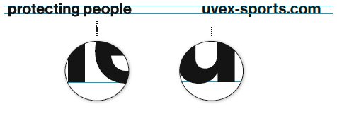
The URL is positioned so that the lower case letters of both elements sit on exactly the same format line.

Only one URL is ever placed by the baseline. It must only be on one line and without "http://" and "www.", provided the hyperlink still works.

Example URL

Additional URLs and QR codes

In addition to the URL on the baseline, one additional URL can be positioned prominently in the layout, provided that there is a clear connection to the content (e.g. link to microsite, online special feature, etc.). In this case, the size can be adjusted in line with the layout. QR code and corresponding URL are positioned to appropriately in the layout.
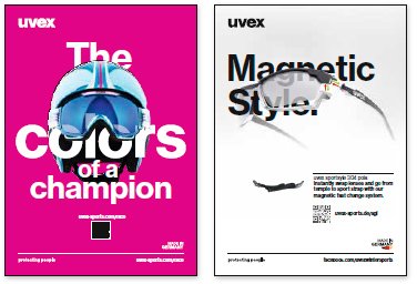
Example of URL placement with QR code

Secondary elements: other

Other elements: size and placement

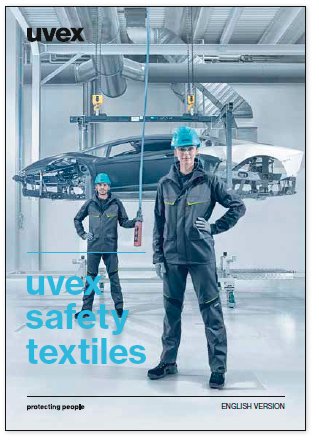
Other secondary elements could simply be information, for example "English version". The size of the font is again determined by the size of the claim. Any font type can be selected.

Font size Secondary elements

Claim width Font size Secondary elements
25 mm 8.48 pt
30 mm 10.191 pt
40 mm 13.644 pt
60 mm 20.302 pt
100 mm 33.889 pt
140 mm 47.45 pt

Secondary elements: "Made in Germany"

Basic shape

Alignment

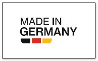
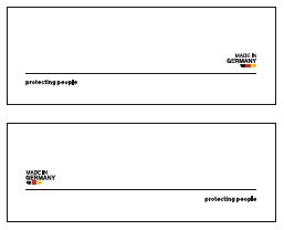
The alignment of the MIG logo is always based on where it is placed in the layout.

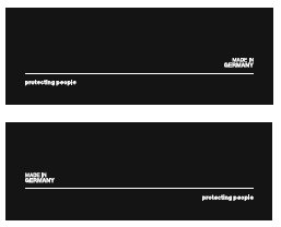
Negative version

On images/backgrounds/colours on which the colours of the German flag would not be recognisable, negative lettering should be used without the flag.

Sizes

If the logo is on the basic line, its size is based on that of the claim. In normal cases, the logo should the same width as "protecting". The size can be adjusted if it is placed in the layout.

Alternative version when there is less space

If there is not sufficient space in the layout to position the "Made in Germany" logo appropriately with adequate space, then the following version can be used as an alternative.

The alternative version must always be in bold font style. This text should be the same height as the claim. It is positioned below the baseline in accordance with the guidelines and can take the place of the URL.

All alternative options are supplied as EPS files.

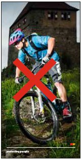
Secondary elements: no gos
Print
Select Language
Please choose an area: